Disclaimer: We only recommend products or services that we believe will add value to our readers. By using these affiliate links, we’ll receive a commission if you purchase through our link, at no extra cost to you. Please read full disclosurehere
I know how much the colors in my bedroom can change how I feel every day. The shades on my +walls can make me feel calm, happy, or even excited when I walk in. Choosing the right bedroom colors lets me create a space that truly feels like my own cozy retreat.
Sometimes, all it takes is a new color on the walls to spark fresh energy and new vibes in my space. I love exploring creative ideas and seeing how others use color to express their style and bring warmth or boldness to a room. There’s something so inspiring about turning simple paint into a whole new mood in my bedroom, and I’m excited to share these ideas with anyone hoping to make their own room feel special.
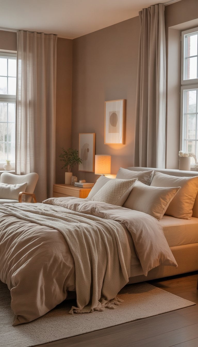
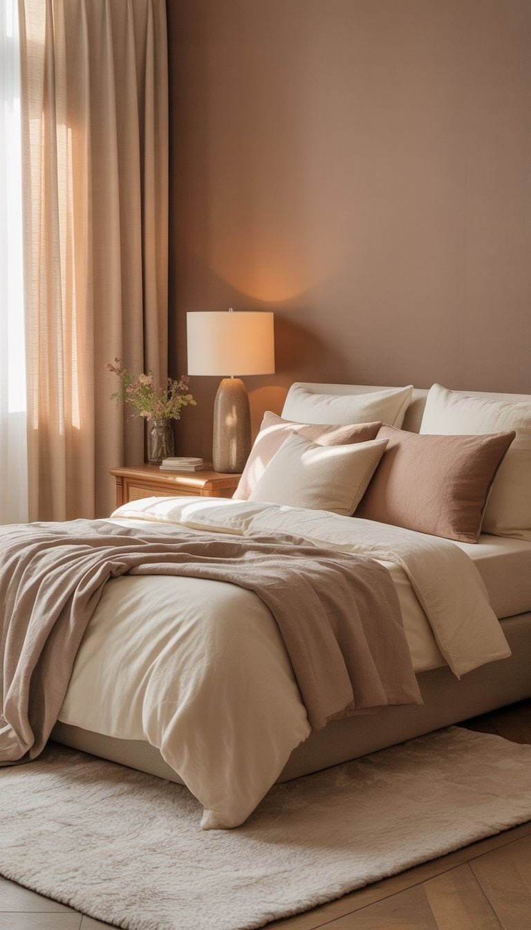
Soft Taupe for a Warm, Cozy Feel
I love how soft taupe brings a gentle calmness to any bedroom. Taupe is a great mix of brown and gray, which makes it feel grounded but never cold.
When I paint with taupe, my room instantly feels warmer. It’s an easy color for creating a cozy space where I want to relax.
Pairing taupe with cream or muted peach accents makes everything look inviting. This color also looks beautiful with natural wood or soft textiles.
I’ve noticed that taupe paint colors are super versatile. They work for any style, from modern to traditional.
Whenever I choose taupe, I get a timeless look that stays fresh season after season. It’s my go-to when I want comfort without sacrificing style.
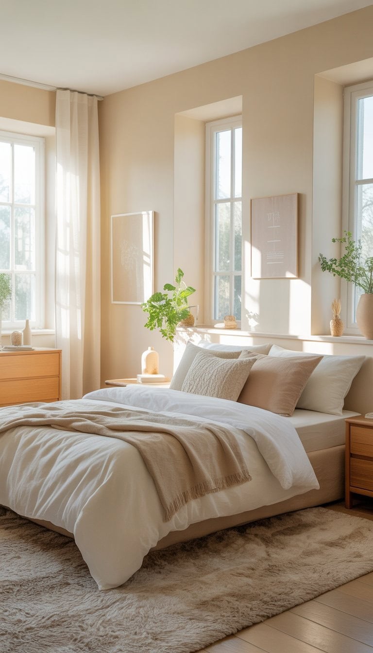
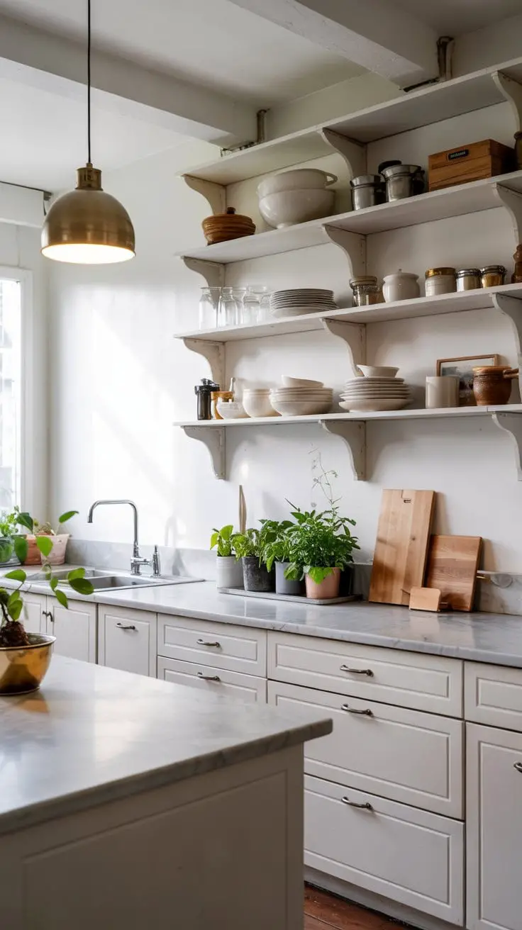
Creamy White to Brighten Spaces
I love using creamy white paint when I want a bedroom to feel light and welcoming. It’s warmer than plain white, so the room feels cozy instead of cold.
Creamy white works well if you want to brighten up a small space, especially one with little natural light. It helps reflect what light there is, making everything look brighter.
I’ve noticed that creamy white pairs nicely with wood, soft pastels, and even bold colors. It gives me a lot of flexibility to change up my decor. Warm creams, like “White Blush” by Behr, are a great pick since they brighten up the space and don’t look too harsh next to wood accents. You can read more about using cream white paint to brighten spaces if you’re looking for ideas.
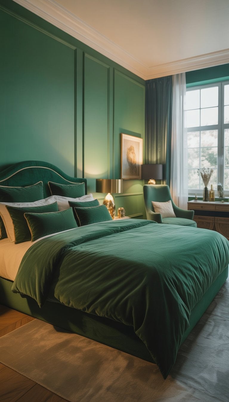
Emerald Green for a Luxurious Touch
When I want to bring elegance into a bedroom, I often turn to emerald green. This shade feels rich and calming at the same time. With emerald green, even a simple room can look more put together.
I like to use emerald green on an accent wall or with bedding. The color pairs well with gold, wood, or black details. It adds a touch that feels both refreshing and cozy to me.
I’ve noticed that boho and modern bedrooms both use this shade a lot. It really stands out in designs focusing on nature or luxe textures. If you want more inspiration, these emerald green bedroom ideas are worth checking out.
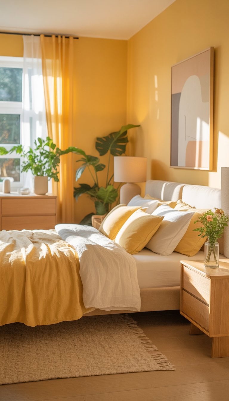
Butter Yellow to Cheer Up Mornings
I always notice how a butter yellow shade makes any bedroom feel warmer and more inviting. This color reminds me of sunshine, making it a cheerful start to every morning. It feels fresh but never overwhelming.
What I like most about butter yellow is how easy it is to match. I can pair it with white, light gray, or beige for a calm look. It also works with natural wood tones, adding a cozy touch to the room.
I’ve seen butter yellow make even small spaces feel bigger and brighter. If I want my mornings to start with a peaceful, happy vibe, this soft yellow is my go-to. For more inspiration, I find ideas at Butter Yellow Home Decor.
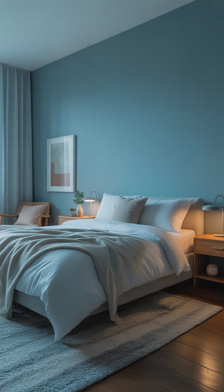
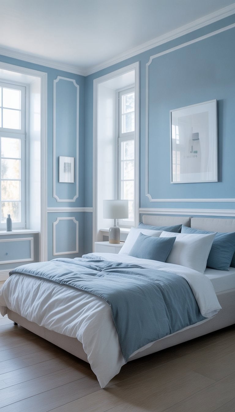
Muted Blue for Ultimate Relaxation
When I want a bedroom that feels calm and peaceful, I always go with muted blue. This soft shade reminds me of the ocean and clear skies on a quiet day. It helps me leave stress at the door.
Muted blue isn’t bold or flashy, but that’s why I like it. It gently fills the room with a soothing touch. When I pair it with light bedding or white accents, the whole space feels cozy and fresh.
Designing with muted blue gives me a sense of escape. Experts often say this color brings a spa-like atmosphere to bedrooms, making it easy to unwind after a long day. I find inspiration for muted blue bedrooms on sites like Pinterest and Better Homes & Gardens.
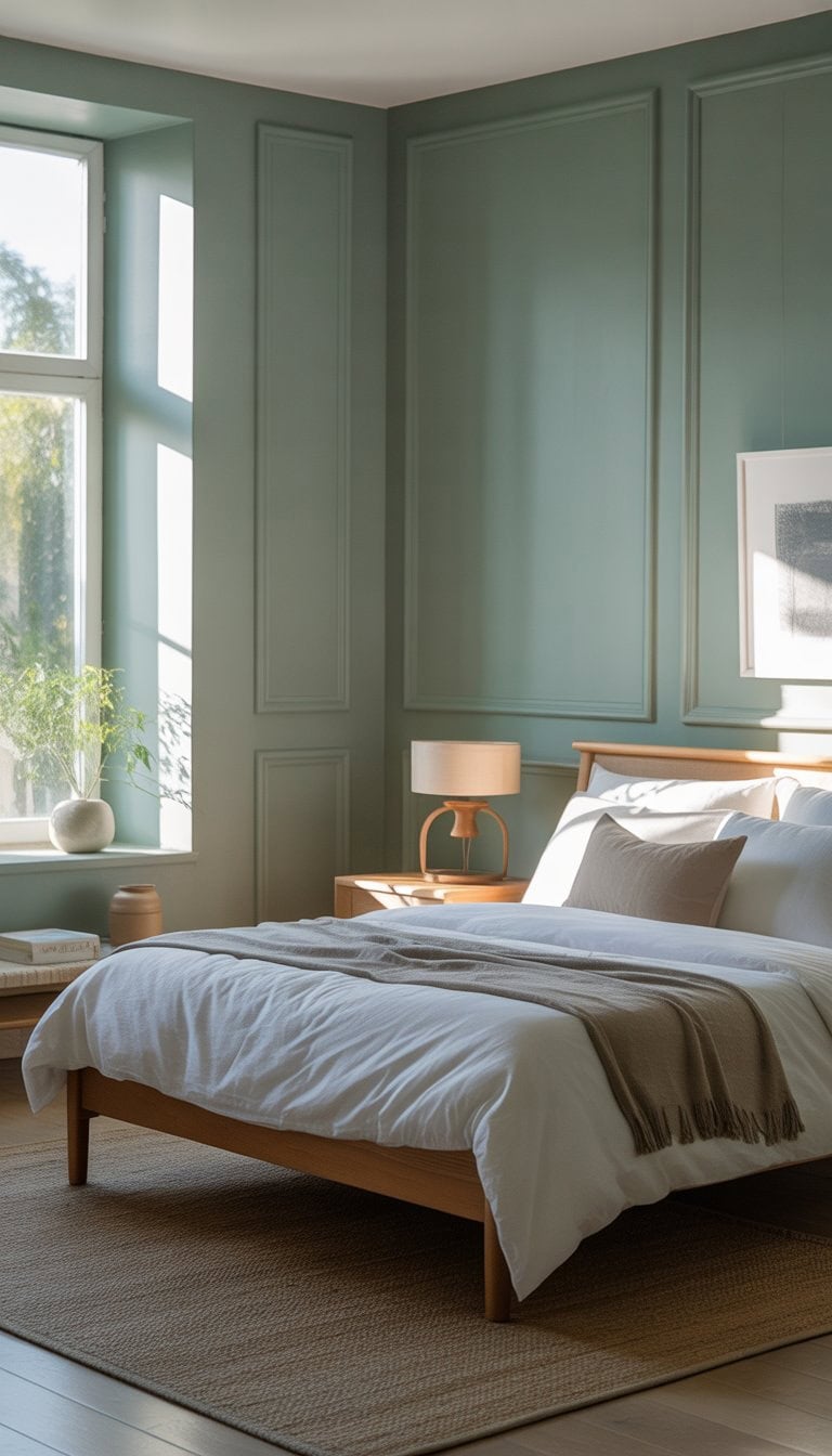
Pewter Green in Natural Light Rooms
When I painted my bedroom pewter green, I noticed how different it looked depending on the sunlight. In rooms with lots of natural light, this color feels surprisingly fresh but still calming. The light brings out soft gray and green tones, making everything look balanced.
I love how pewter green creates a peaceful space without feeling cold. During the day, the sunlight highlights its earthy vibes, almost making my space feel connected to nature. It works great for an accent wall or the whole room.
If you want ideas for decor and accent walls, I found a lot of inspiration from pewter green bedrooms. This shade is flexible and works well with different kinds of furniture and styles.
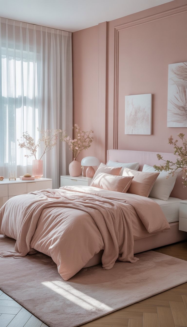
Blush Pink with Powder White Accents
I love how blush pink makes a bedroom feel soft and calm. It’s a color that’s grown-up but still light and fresh, especially when I pair it with powder white accents.
When I use blush pink on the walls or bedding, the room feels warm and inviting. Adding touches of powder white—like throw pillows or curtains—helps keep things looking crisp and clean.
Mixing these two simple colors gives my bedroom a cozy look without feeling too playful or girly. I’ve found that this color combo really works if I want a relaxing spot that feels bright, gender neutral, and peaceful. If you want more ideas or tips, you can find great blush pink bedroom ideas online that show how well pink and white go together.
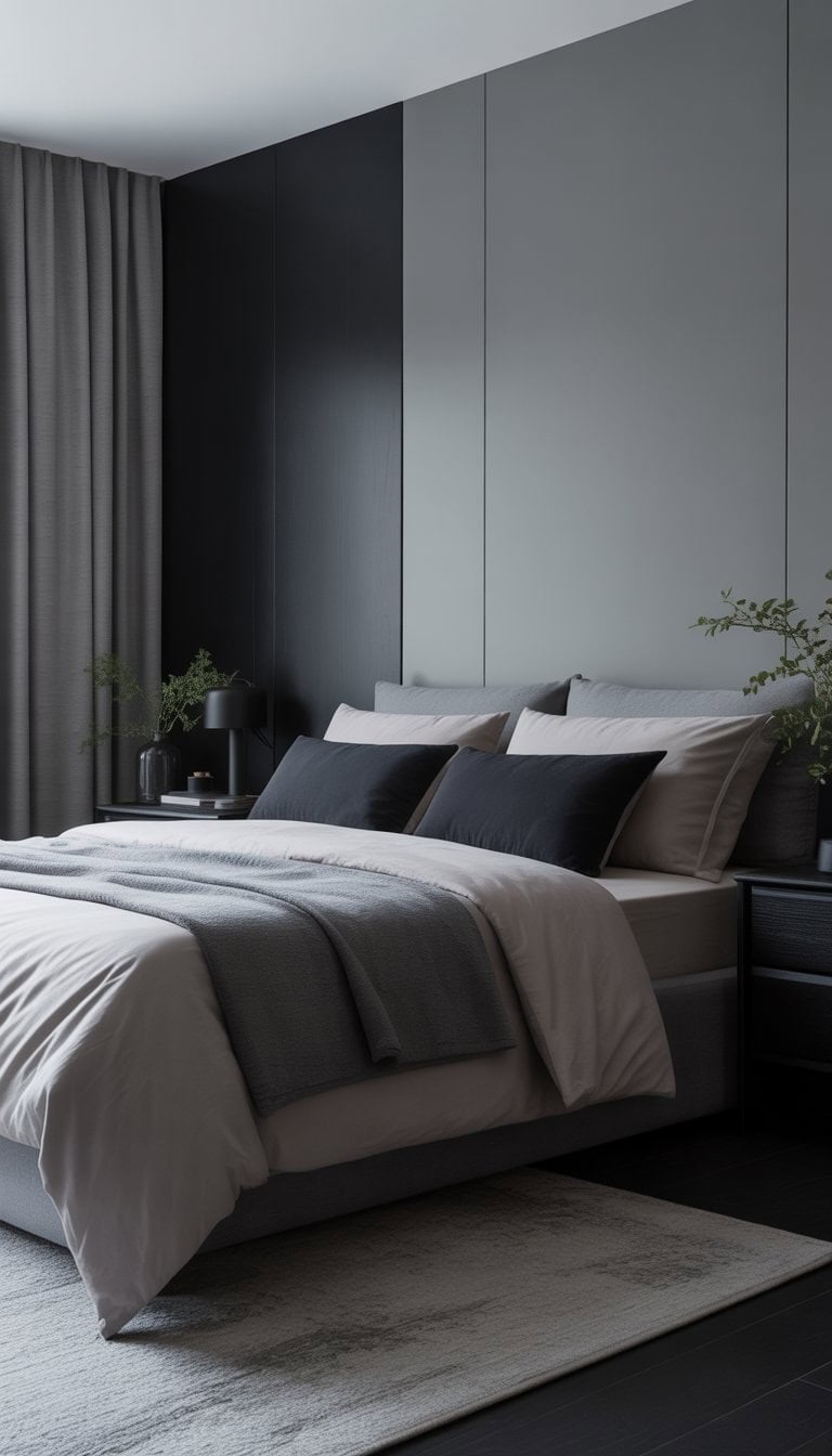
Ebony and Soft Gray for Modern Drama
I love mixing ebony and soft gray in bedrooms for a clean, modern look. The deep black adds drama and makes any space feel more sophisticated. When I pair it with soft gray, the contrast feels balanced and not too harsh.
Black furniture against gray walls always catches my eye. The look is sleek but still calming, especially if I add cozy blankets or textured rugs. I find that gray can make black accents stand out without feeling heavy.
If I want extra flair, I’ll bring in artwork or pillows with both colors. There are even more creative ideas for a gray bedroom with black furniture on Pinterest. This pairing never goes out of style and always feels fresh to me.
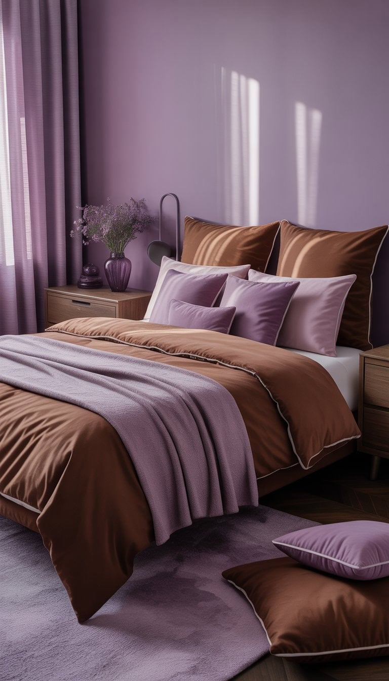
Chocolate Brown and Violet Combo
I love how chocolate brown and violet bring a unique warmth to any bedroom. It feels modern yet cozy, especially when I use soft violet bedding against dark walls or furniture.
These two colors work so well together because brown adds richness while violet brings a pop of color. I find that adding small accents like throw pillows or a rug in violet helps balance the look.
Sometimes, I mix in lighter shades like lavender or taupe to keep the room from feeling too dark. This combo creates a relaxing space that still feels interesting. If you want a fresh twist, this pairing is both bold and inviting, and I find it easy to personalize for my style.
Designers also recommend this combo because chocolate brown and purple create a calming, stylish space, as seen in decorating ideas.
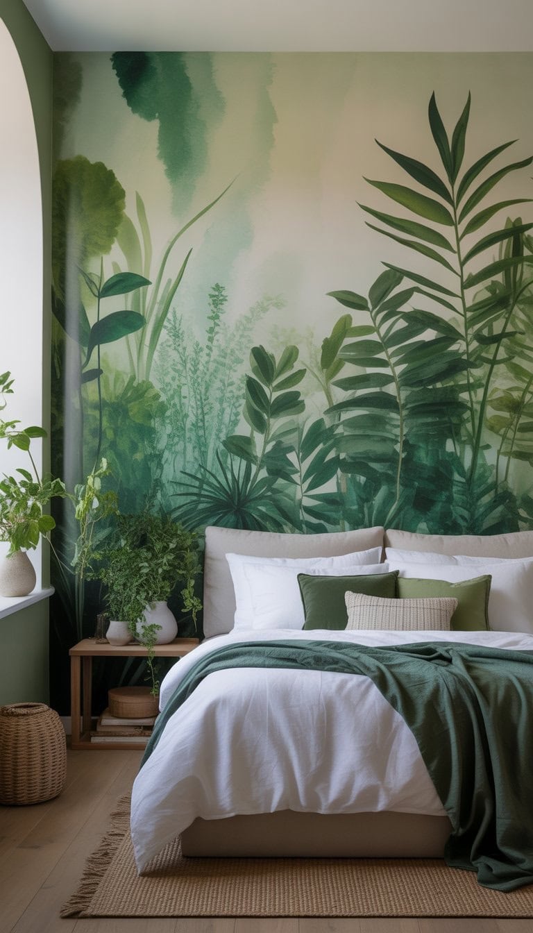
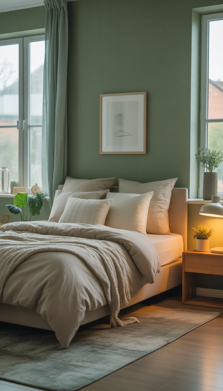
Botanical Greens to Connect with Nature
When I want a bedroom that feels peaceful and fresh, I use different shades of green. Greens can remind me of gardens, forests, and wide open fields. Adding green to my bedroom helps create a calm and restful space.
I love how botanical greens work with natural materials like wood, cotton, and linen. Even a few green plants or pillows can make a big difference. These touches remind me of the outdoors and help me relax after a long day.
When I mix greens with earthy browns or simple white walls, my bedroom feels balanced and inviting. I’ve found lots of inspiring ideas in green bedroom designs and botanical bedrooms that keep me connected to nature every day.
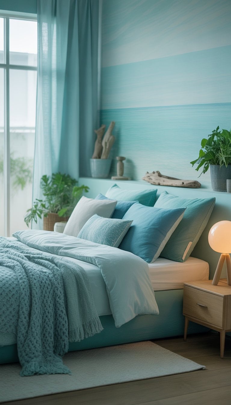
Aquatic Shades for a Soothing Vibe
When I want a peaceful escape right in my own bedroom, I reach for aquatic shades. Soft aquas, sea mist, and light turquoise create a calm, relaxing mood.
I like how these colors make a space feel cool and fresh, just like a day by the water. A light blue-green, for example, reminds me of crystal-clear seas and wide-open skies.
I often mix these shades with white or sandy-colored accents. This winning combo looks clean and cozy to me. If you want more inspiration for using these colors, check out these aqua and sea mist bedroom ideas.
These soft aquatic tones work well with natural textures. I find adding driftwood or woven baskets really brings out the coastal charm.
Warm Taupe with Cream Highlights
I love pairing warm taupe walls with cream accents in the bedroom. The taupe gives the room a cozy base that feels calm but never dull. Cream highlights in bedding or curtains help brighten up the space.
Sometimes I add a cream-colored rug or throw pillows to break up the deeper tones. This combo always feels inviting and restful at the end of a long day.
Taupe works well because it’s a good balance between gray and brown. It can have a warm undertone, so it never feels too cold or too dark. The cream details add just enough contrast to make the whole room pop with a soft, welcoming look.
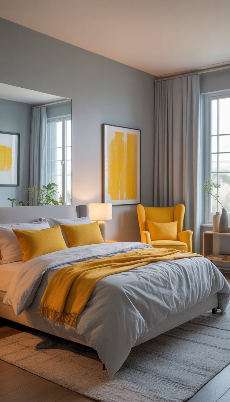
I’ve always loved how squash yellow can brighten a bedroom. The color brings a touch of sunshine without being too bold or overwhelming.
Pairing squash yellow with a soft gray creates a really nice balance. The gray keeps things calm and grounded, making the yellow pop just enough. This combination can make a space feel inviting and cheerful every day.
I find that using yellow for accents like pillows or bedding works well, while gray walls or furniture help the room stay peaceful. This mix feels fresh and modern. It works especially well if you want a dynamic yet balanced color scheme, as shown in many bedroom inspirations.
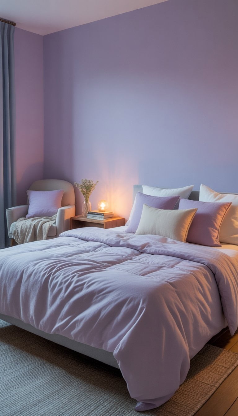
Light Lavender for Calm Evenings
I always notice how a light lavender shade brings a gentle, peaceful feeling to my bedroom right away. It’s calm without being boring, and it helps me relax after long days.
When I painted my walls lavender, my room instantly felt softer and more inviting. The color is light enough to keep the space bright, but it still adds a little style and personality.
I like pairing lavender with simple bedding and soft lighting for extra comfort. Using this soothing pastel on all four walls can make the whole room feel harmonious and restful, which is ideal for winding down in the evenings, just as suggested in calming bedroom paint color ideas.
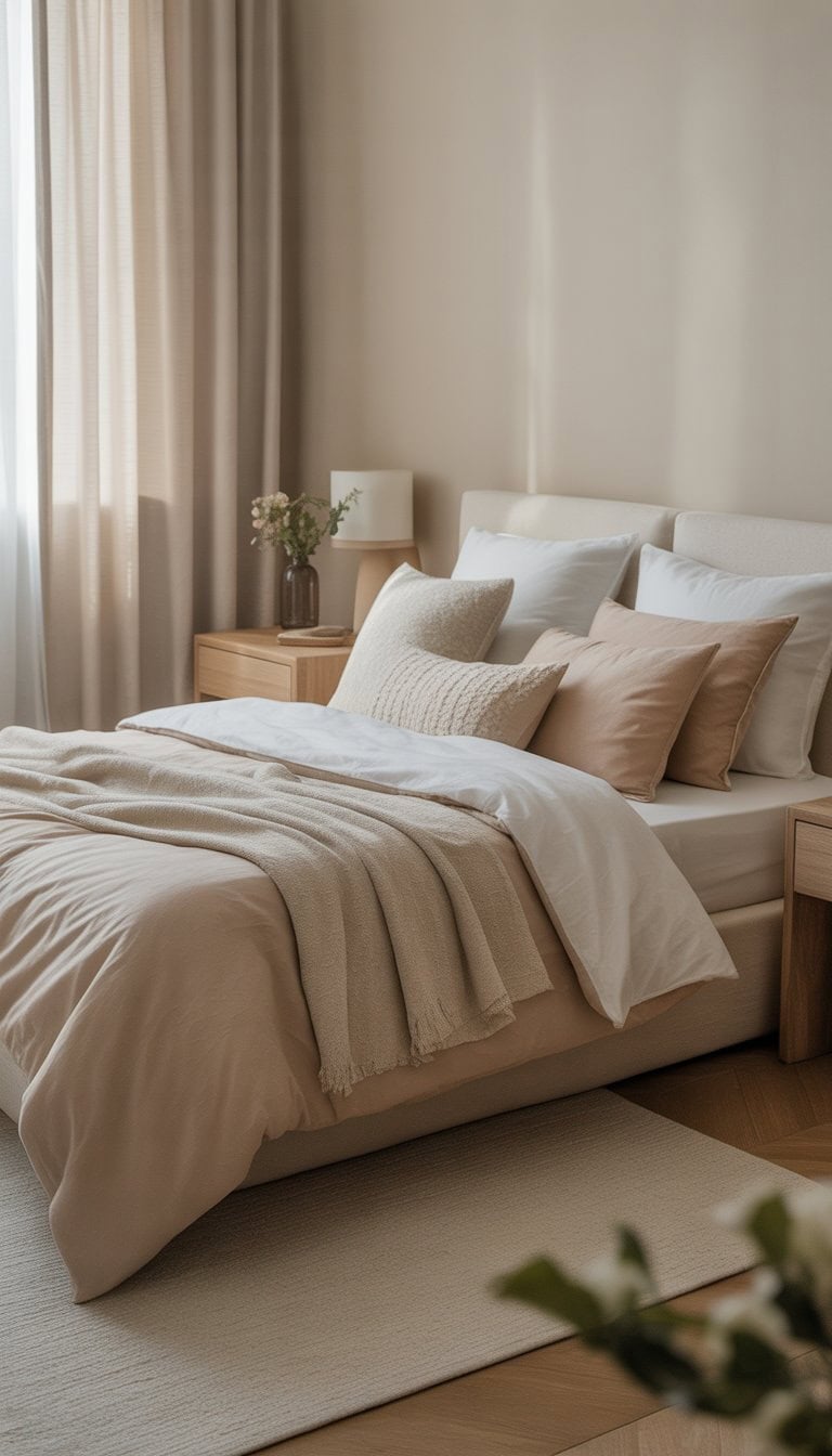
Soft Neutrals like Beige and Ivory
I love using soft neutrals like beige and ivory in a bedroom. These colors always make my space feel cozy, clean, and inviting. They bring in a gentle light and help everything look a little more peaceful.
When I pick beige and ivory, I can easily add blankets, pillows, or art in other shades and it all still looks great together. It is so simple to mix textures, too—like soft wool, smooth cotton, or light linen.
For anyone searching for bedroom ideas, I suggest neutral colors to create a calm place to relax. These shades also work with almost any style, whether my taste changes or stays the same.
Gentle Blues with White Trims
I find that gentle blue walls always make my bedroom feel calm and open. The softness of blue gives the whole space a peaceful vibe, especially when I use lighter shades.
Pairing these blues with crisp white trims on the windows and doors really makes the color pop. The contrast looks fresh but not harsh.
I sometimes add cream or ivory accents to warm up the look. I also like to keep bedding and curtains in light tones so the room stays airy. For more inspiration, I love looking at blue and white bedroom ideas that use this calming color scheme.
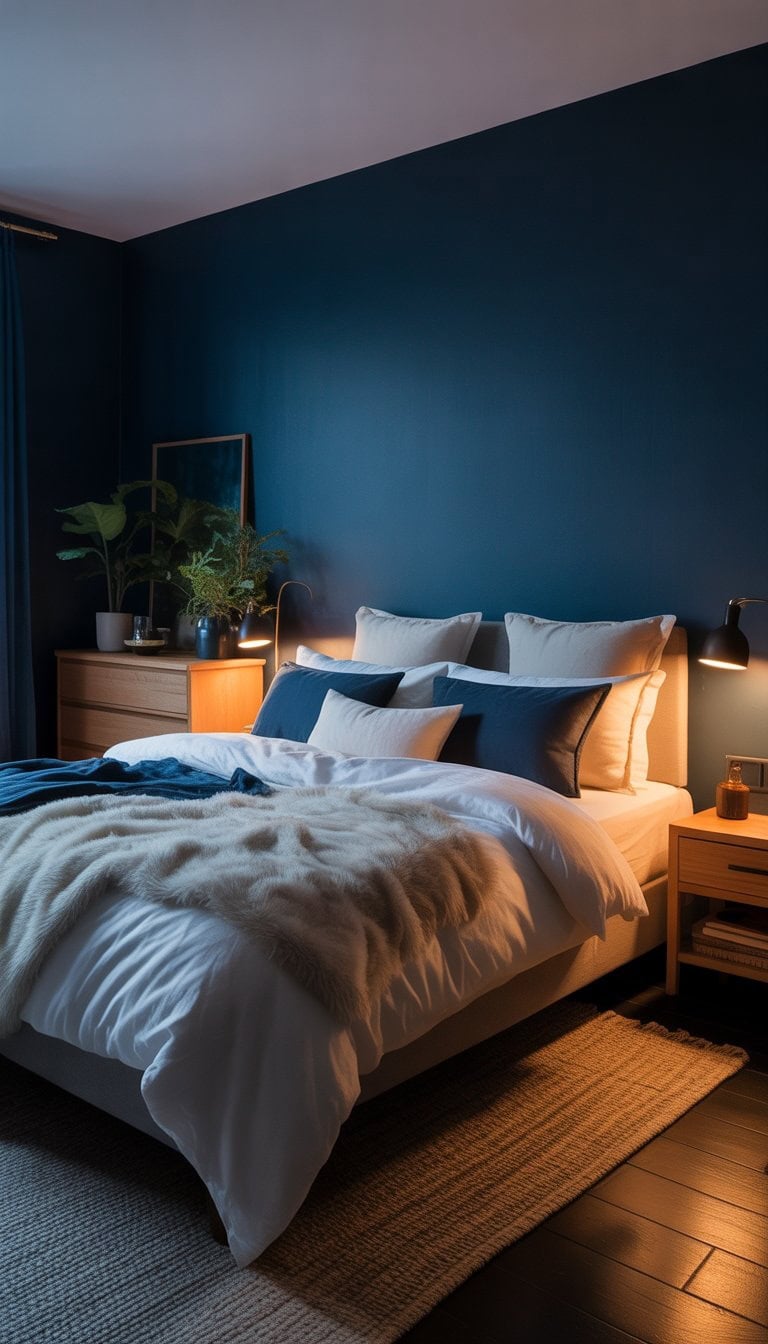
Deep Navy for Moody Yet Cozy
I love how deep navy gives my bedroom a rich, calming vibe. It feels moody but never cold or unwelcoming. Whenever I walk in, I feel instantly relaxed.
A navy wall looks bold but can make the whole room feel cozy, especially when I add soft bedding and warm lights. Dark blue works well with simple whites or even warm wood accents.
When I’m picking paint, I look for shades that are deep but not too harsh. Navy has a way of making other colors pop, whether it’s with art, throw pillows, or metallic touches. I noticed designers recommend navy for a reason—it just works so well for a peaceful space, as shown in these moody blue bedroom ideas.
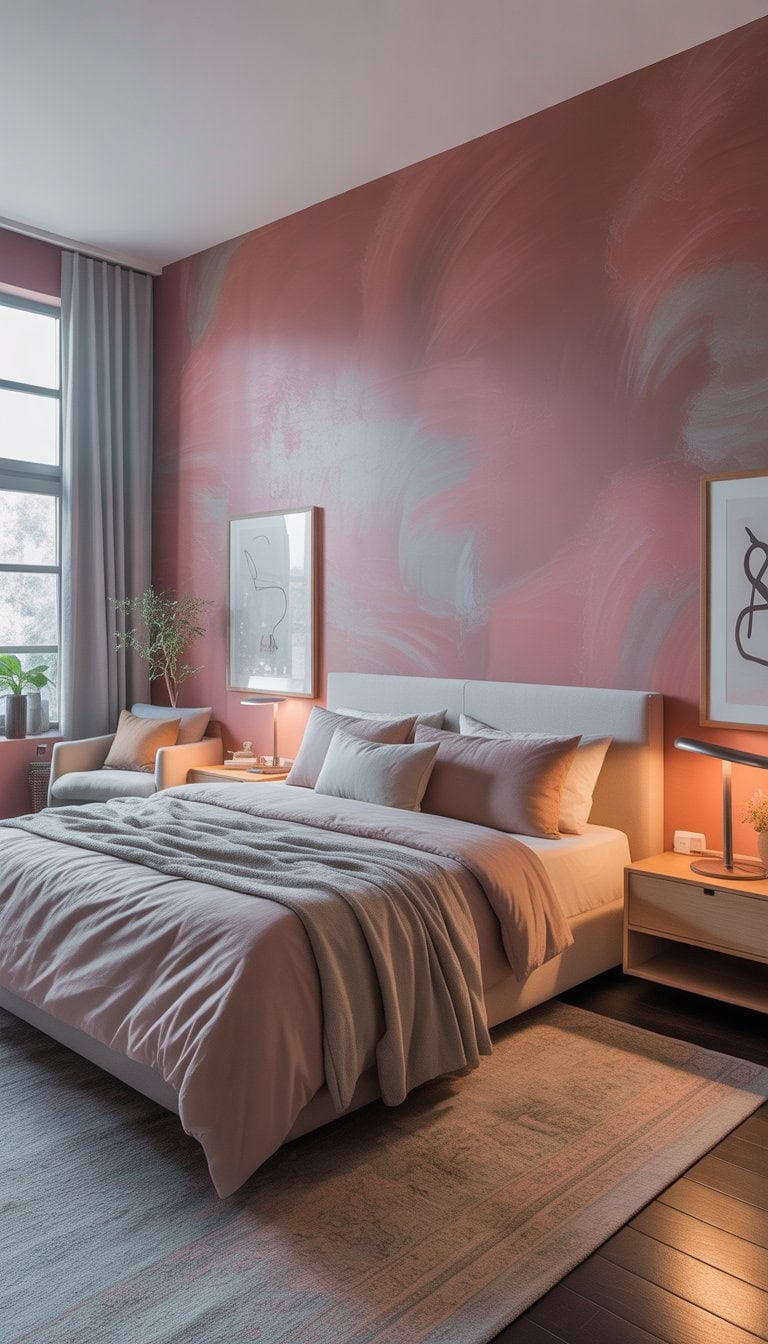
Dusty Rose with Gray Undertones
I love combining dusty rose with gray undertones for a bedroom that feels calm but still has character. The gentle pink brings a soft warmth, while the gray tones keep things from feeling too bright or “girly.”
When I use this pairing, I notice the room instantly feels more relaxed. Dusty rose works beautifully on bedding or accent pillows, with gray walls or furniture grounding the look.
I also like adding soft textures like velvet or knit blankets. Art or lamps in these colors tie things together nicely. For ideas and inspiration, I often browse rooms that showcase this style, like the ones on Pinterest.
This color combo makes my space peaceful, modern, and welcoming without being loud or overwhelming.
Sage Green for Restful Ambiance
I always find sage green to be such a calming color for bedrooms. The soft, muted tone reminds me of peaceful walks through nature. It’s gentle on the eyes and creates a space that feels safe and welcoming.
When I use sage green on the walls or in bedding, my bedroom instantly feels more relaxing. I love how this color blends well with wood, creams, and even hints of gold. My mornings feel fresh and the evenings feel soothing.
Adding soft textures like blankets or curtains in sage green really lifts the space. Even some simple sage green accents can make a big difference. This shade is perfect if, like me, you want a bedroom that feels both restful and stylish. Check out these sage green bedroom ideas for inspiration.
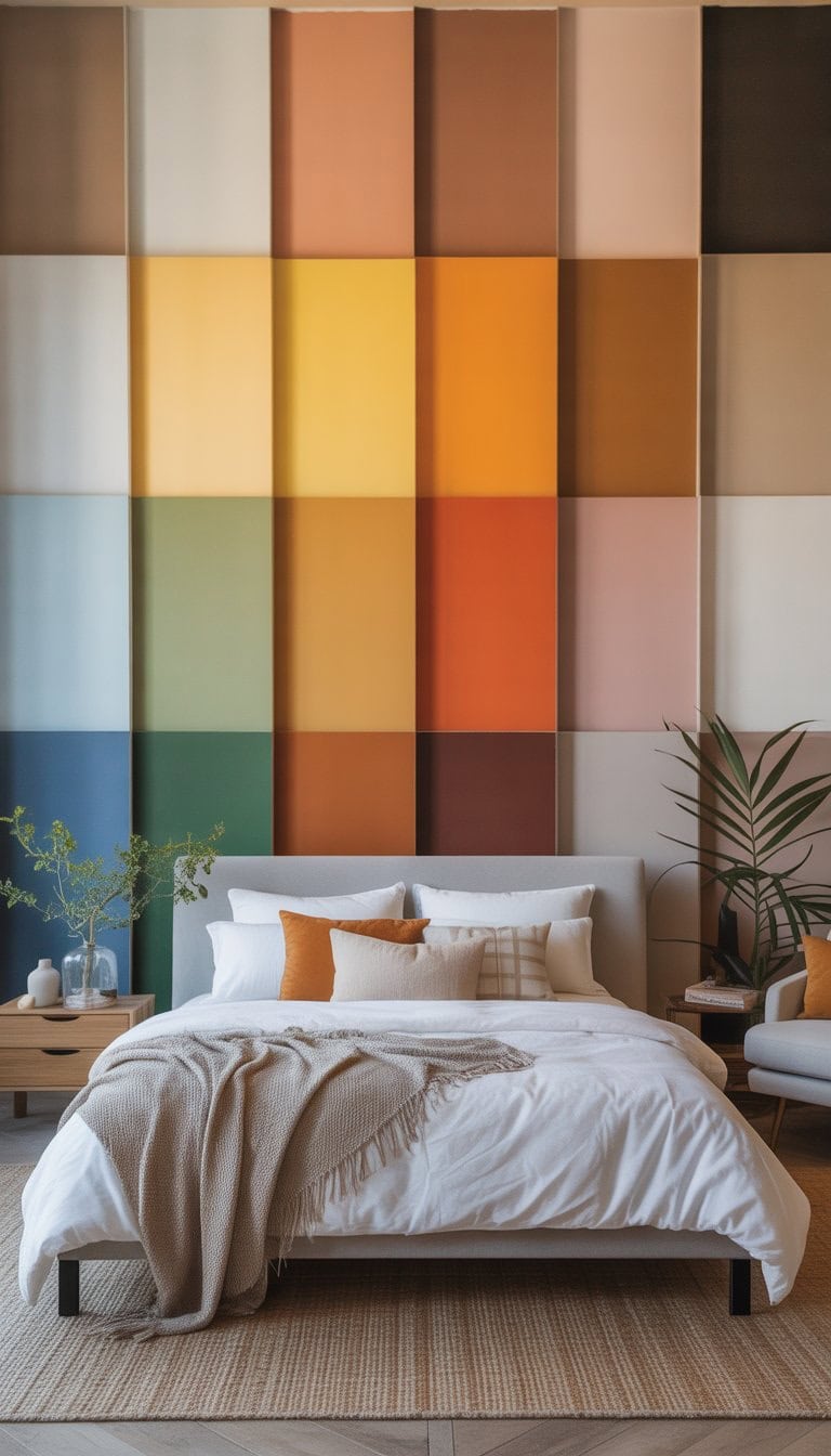
Choosing the Right Bedroom Color Palette
I always notice how much a bedroom changes with the right colors. Picking the best shades means thinking about mood, natural light, and the way accent colors tie everything together. A good palette can make my sleeping space feel restful and welcoming.
Understanding Color Psychology in Bedrooms
I look for colors that set the mood I want when I walk into my room. Soft blues, for example, feel calming and help me relax at the end of a busy day. Greens can bring a sense of freshness and renewal, perfect for those mornings when I need a gentle start.
Warm tones like soft peach or beige can add coziness and warmth. Those are great if I want my bedroom to feel inviting. I sometimes choose muted pinks for a peaceful, nurturing vibe that helps me unwind at night.
I pay attention to how these shades affect me. Cool colors like navy or deep hunter green can make the room feel more serene and balanced, which can help with sleep. If I want a bold look, rich burgundy or deep charcoal add drama without making the space overwhelming. If you want more inspiration, you can find color ideas that impact mood at House Beautiful’s bedroom color guide.
Balancing Natural Light with Color Choices
The amount of sunlight in my bedroom makes a huge difference in how paint looks. In a room that gets a lot of natural light, I use cooler shades like pale blue or soft gray to avoid things feeling too warm or bright. These colors help balance out the sun and make the space feel soothing.
If my bedroom doesn’t get much sunlight, I like to go with warmer hues, such as creamy beige or pale yellow. These colors can brighten up a dark space and make it feel cheerful, even on gray days. For rooms with medium light, earth tones like soft olive or taupe maintain a steady, inviting feel.
I use a simple table to quickly match light levels to colors:
Light Level
Best Color Choices
Lots of sunlight
Cool: Light blue, gray
Low sunlight
Warm: Beige, yellow
Medium sunlight
Earth: Olive, taupe
Blending Accent Colors for a Cohesive Look
My favorite way to add personality is by using accent colors. I pick one or two shades that stand out, like deep teal or blush pink, and bring them in through pillows, rugs, or art. This keeps the look fresh, but still pulled together.
To avoid a cluttered feeling, I make sure my main color covers most of the space, like the walls and big furniture, while the accent colors show up in smaller details. I choose complementary hues so the palette feels balanced, not busy.
When I want a bolder accent, I pick a color opposite my main shade on the color wheel. If my walls are sage green, for example, rich rusty orange makes a sharp contrast but still feels natural. For more color scheme ideas and charts, check out these bedroom color combinations.
Design Tips for Showcasing Bold Bedroom Colors
I’ve found that the best bedrooms balance bright shades by mixing materials and planning how colors move from one area to another. Using textures keeps bold rooms cozy, while smart color placement helps the room feel pulled together, even in open layouts.
Layering Textures and Patterns with Color
When I use bold colors, I love to add lots of different textures to avoid making the room look flat. Velvet pillows, chunky throws, and woven rugs all help soften stronger shades like emerald green or deep blue. For example, a navy wall paired with a linen headboard and a cowhide rug feels both dramatic and inviting.
Patterns are a key trick I use to break up solid blocks of color. I might add a striped comforter or some floral curtains, making sure the pattern has at least one of the room’s main colors. Mixing large prints with small ones makes the space look more layered and less matchy. Here’s a simple layout:
Texture Idea
Example Color
Room Element
Velvet
Teal
Throw pillows
Chunky Knit
Mustard
Blanket
Woven/Basket
Terracotta
Storage baskets
Wood Grain
Black
Nightstand
I always make sure there’s at least one neutral element (like a white bedspread or sandy rug) to help the eye rest and keep the space from feeling too busy.
Creating Visual Flow in Open-Plan Spaces
In open-plan homes, each area can blend together. I find it helps to repeat an accent color, like burnt orange or soft sage, in smaller decor pieces throughout the space. If the bedroom is in an open loft, I might echo the wall color in throw blankets, lamps, or artwork in nearby spaces.
Changing up the intensity or shade keeps things interesting. For example, a bold emerald wall in the bedroom looks great paired with lighter green vases or pillows in the living space nearby. This trick keeps everything connected without being too matchy.
I keep furniture lines simple and layouts open, which lets the colors shine without overwhelming any one spot. Using area rugs to separate spaces is a favorite of mine, too. It helps mark where the bedroom ends and the next area begins, while still letting color move naturally through the whole area. For specific ideas and visual inspiration, I recommend the moody designs on this guide to bedroom color schemes and creative wall ideas on this accent wall list.
Frequently Asked Questions
I love picking bedroom colors because they really do change the whole mood of a space. The right shade can bring comfort, romance, relaxation, or even more energy to my mornings and nights.
What hues inspire relaxation and calm for adult bedrooms?
When I want a peaceful retreat, I go for soft taupe and muted blue. These colors help me unwind after a busy day.
Muted blue, in particular, is known for its soothing effect and always makes my bedroom feel more restful.
What are the top color picks for a romantic couple’s retreat?
For a romantic vibe, I like to use blush pink, deep plum, or even emerald green. These shades bring a sense of luxury and coziness.
Pairing these with dim lighting and soft textures adds to the intimate feel.
Which paint colors are known to help improve sleep quality?
If I’m looking for better sleep, I choose colors like cool blue, gentle green, or light gray. Soft hues like these make my room feel calm and help my mind relax before bedtime.
What are the trending wall color combinations for contemporary bedrooms?
Trendy bedrooms right now feature pairs like blue and white, beige and olive, or even grey and blush. I see these combinations a lot in modern spaces for their fresh, updated look.
Can you suggest some uplifting colors that brighten a bedroom space?
Butter yellow and creamy white are my go-to shades for adding brightness. These colors let natural light bounce around the room, making it feel cheerful.
I also find that touches of apple green or sky blue can perk up any dark corner.
How do distinct shades influence the atmosphere of a bedroom?
Each color brings its own mood. Soft taupe always makes my room feel cozy and inviting, while emerald green creates a touch of elegance.
Lighter tones like creamy white lift my mood, and muted blue calms me down. The atmosphere really changes depending on the palette I pick.