Whenever I walk into a space that feels calm but still full of personality, I know I’m somewhere special. If you’re like me and love the idea of a peaceful home but crave a little energy from color, you’re in the right place. Neutral home decor with pops of color is my favorite way to create a welcoming vibe that always feels fresh and unique.
I’ve spent years experimenting with color and neutrals in my own spaces, and nothing compares to the balance and joy this style brings. There’s something magical about soft backgrounds accented with cheerful touches—whether it’s a bright pillow, a fun piece of art, or an unexpected detail. If you want to feel inspired every time you walk through the door, you’ll love these ideas as much as I do.
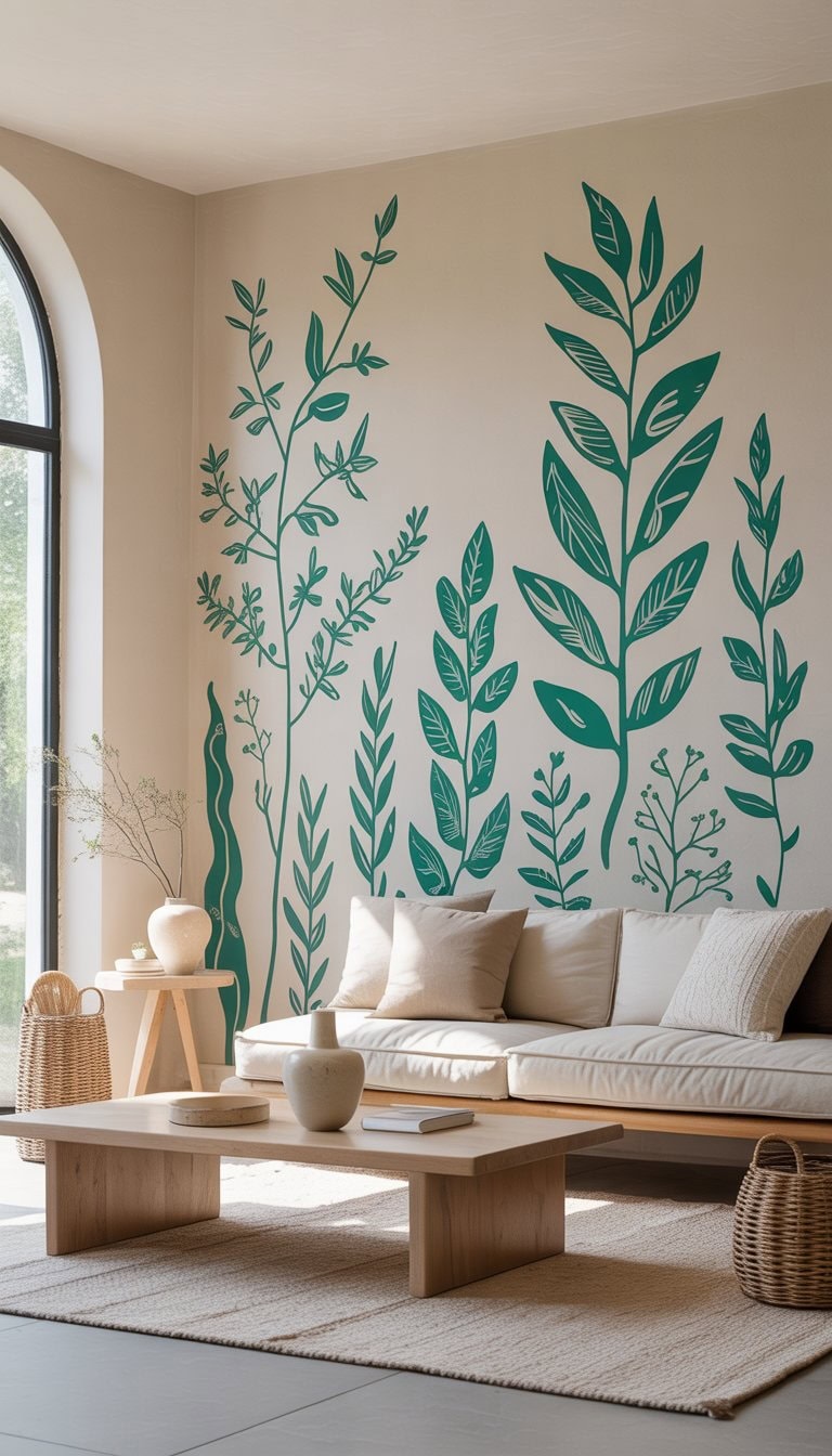
Start with a muted teal accent wall for serene color
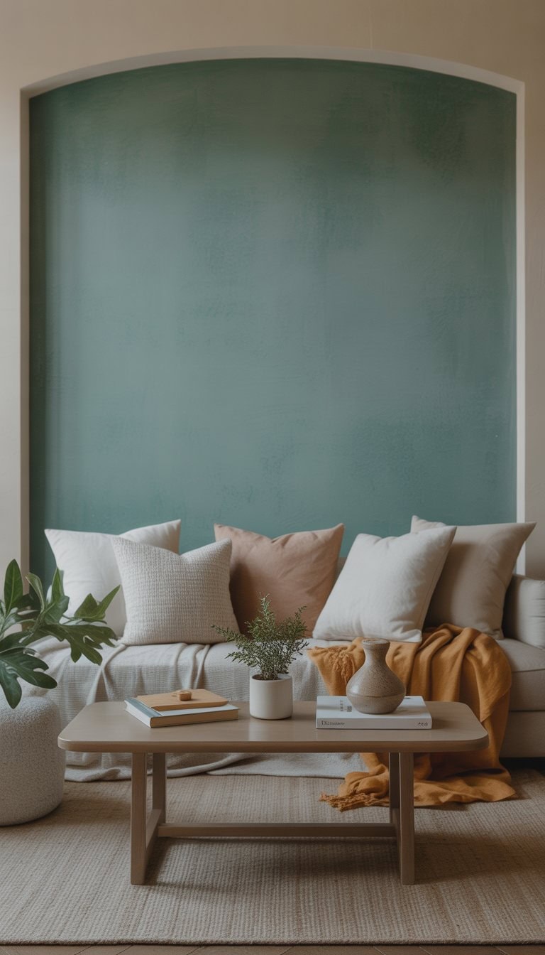
I like to add a muted teal accent wall to bring calm energy into a room. Teal is cool and gentle, so it works well with neutral furniture and decor.
I often find that a muted teal pairs nicely with soft grays and whites. It doesn’t feel too bold, but it still adds color in a subtle way.
If you want more ideas, check out these dark teal living room accent wall inspirations.
Add terracotta pots with lush green plants
I love using terracotta pots to display my favorite green plants. They add a warm, earthy color that stands out against neutral walls and furniture.
Sometimes I group a few pots in different sizes together. This makes any corner feel lively and fresh in a simple way.
Adding plants in terracotta pots helps me mix nature and color without making a space feel busy. For more creative ideas, I get inspired by these stylish terracotta pot uses.
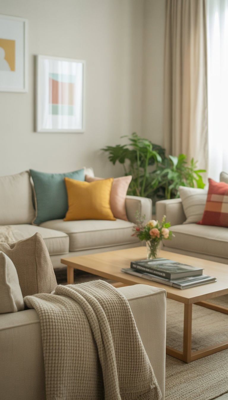
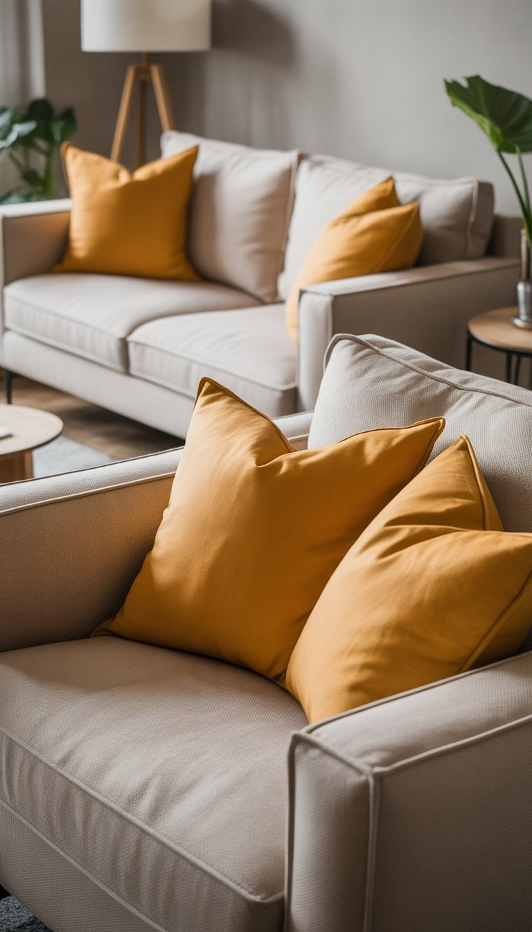
Incorporate mustard yellow throw pillows
I love using mustard yellow throw pillows to add a bit of warmth to a neutral room. The color feels bold without being too bright, and it brings a cozy vibe to any space.
When I mix mustard yellow pillows with beige or gray sofas, the whole room feels more cheerful. This color looks great with other soft tones, too.
For some unique ideas, I sometimes look at collections of mustard yellow throw pillows to find new textures or patterns I haven’t tried yet.
Use sage green curtains for subtle earth tones
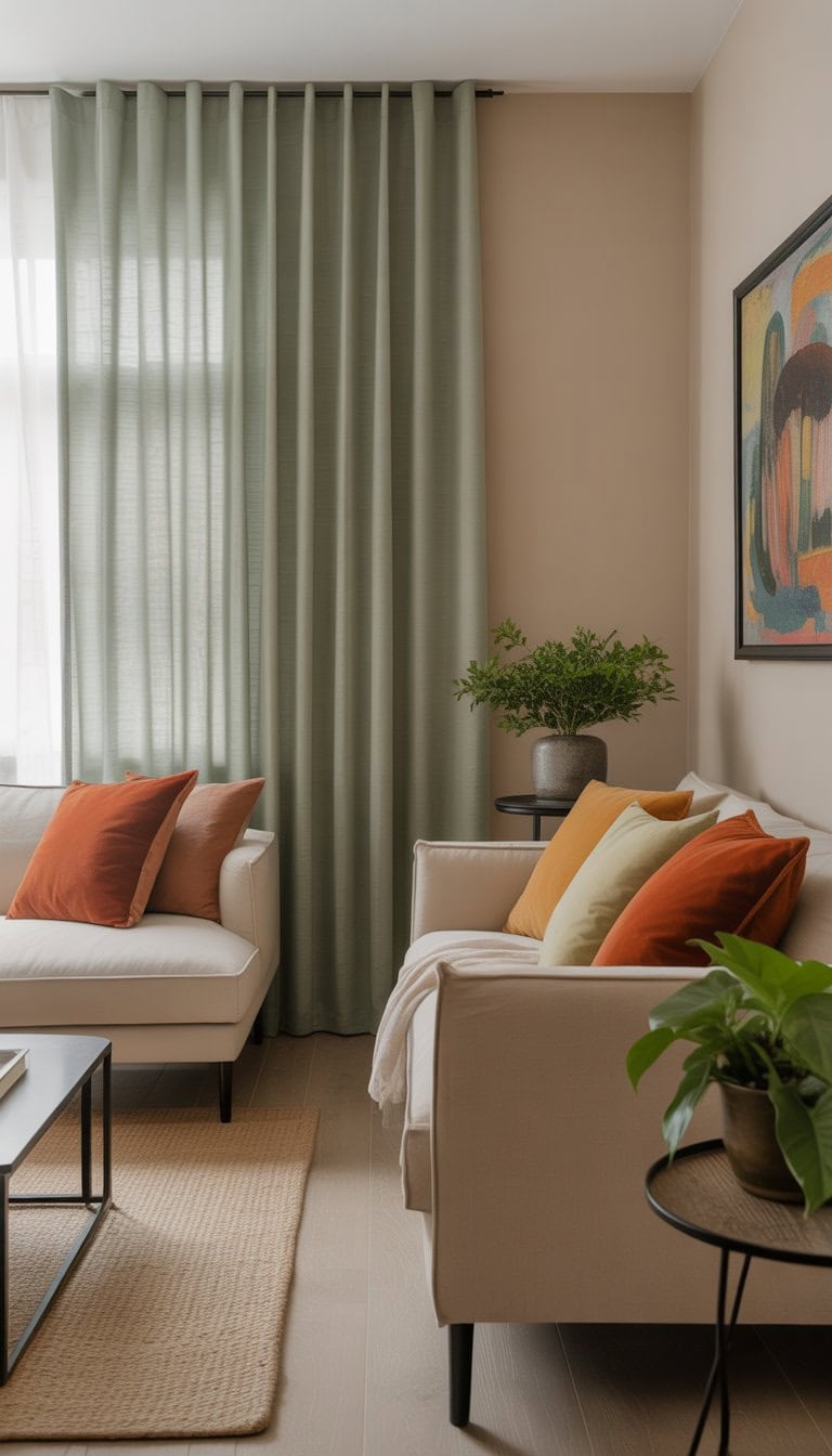
I like how sage green curtains can add a calming touch to a room. The color feels down-to-earth and works well with both wood and neutral colors.
When I use sage green curtains, the space looks peaceful and balanced. This color is easy to match with beige, white, or tan furniture.
If you want a soft color pop that stays classy, sage green is a great pick for any room. For more color ideas, check out these sage green decorating ideas.
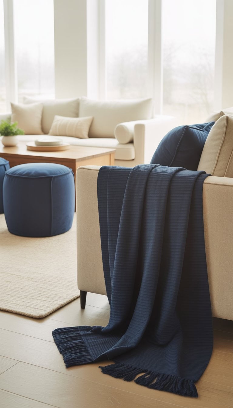
Mix wooden furniture with navy blue cushions
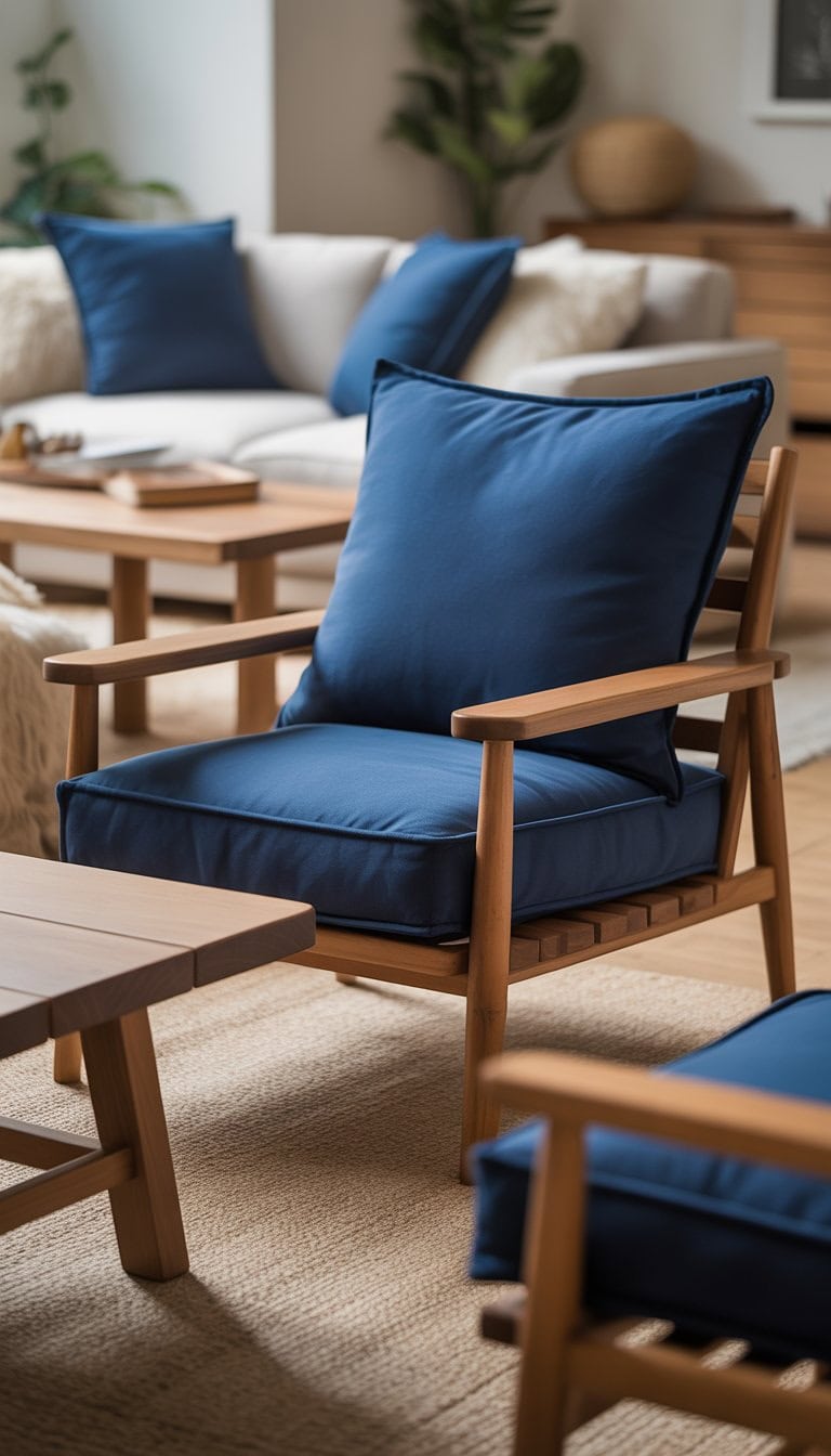
I love how the rich tone of navy blue cushions looks against natural wood furniture. The deep blue makes the wood grain stand out, giving the whole space a classic but relaxed vibe.
It’s easy for me to switch up accent colors, too. Navy pairs well with soft creams, warm yellows, or even a pop of cherry red for a bold touch.
Adding navy cushions to my wooden pieces felt like a simple update, but it brought new life to the room. I always enjoy customizing the look with different throw pillows or textured blankets. If you’re looking for color inspiration, navy blue matches many colors without being overwhelming.
Opt for large modern floral curtains
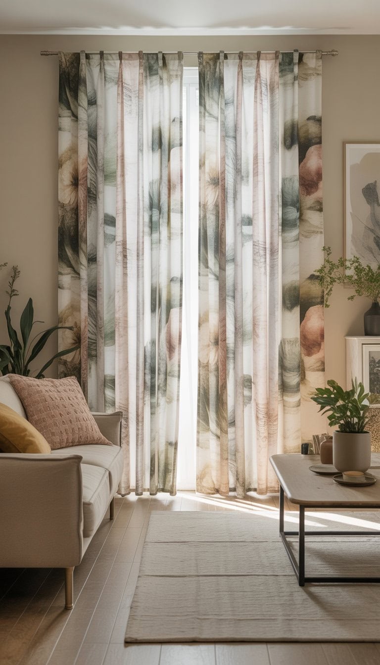
I love using large modern floral curtains to add character to a neutral room. The bold prints stand out, but the soft backgrounds keep the space feeling calm.
When I want a bit of warmth and a gentle burst of color, these curtains do the trick. They draw the eye without taking over the whole room.
I’ve seen great looks in rooms that blend vintage-inspired florals with simple, neutral decor. Choosing the right pattern is key—too busy can overwhelm, but a gentle floral feels just right. For inspiration, check out ideas for vintage floral curtains.
Layer neutral textured rugs with pops of rust orange
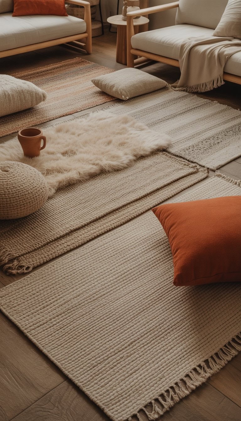
I love starting with a soft, neutral rug as a base. It adds warmth but doesn’t overpower the room. Textures like jute, wool, or cotton make the space feel cozy.
When I add a rust orange throw pillow or a small area rug, it creates a bold accent. The color catches the eye but still feels natural next to creamy whites and beiges.
I’ve noticed that even a simple orange or burnt orange pattern on a neutral rug can change the whole vibe. You can see more ideas for using orange in living rooms to inspire you.
Choose bold striped blankets in cream and brown
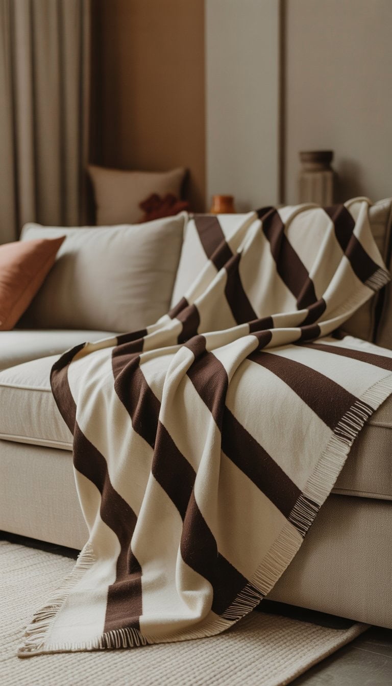
I love using cream and brown striped blankets to add interest to a neutral room. The stripes catch my eye, but the colors stay soft and welcoming.
These blankets work well on the edge of my bed or draped over a favorite chair. The pattern adds just enough personality without taking over the space.
Mixing textures, like a chunky knit or a lightweight cotton, makes the room feel warm and lived-in. For me, cream and brown stripes always help things look cozy but still modern.
Display ceramic vases in soft pink hues
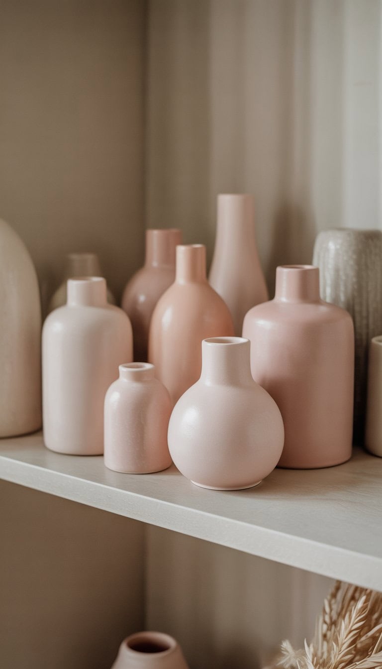
I like to use ceramic vases in gentle pink shades to add color without overwhelming a room. These vases look great on shelves, coffee tables, or even entryway tables.
A soft pink vase feels fresh and subtle next to neutral decor like white or beige. Sometimes I fill mine with simple greenery for a calm look.
I’ve found that modern pink vases, like these soft pink ceramics, blend easily into most spaces. They’re an easy way to bring a gentle pop of color to any room.
Install spa blue lampshades on minimalist tables
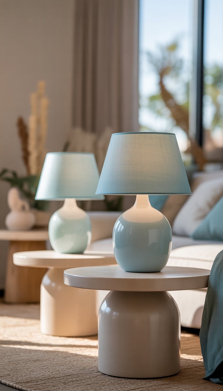
I love adding a splash of color to a neutral room. One simple way I do this is by placing spa blue lampshades on my minimalist side tables. The blue really stands out against white or wood finishes.
I look for lamps with clean lines and smooth shapes. This helps the space feel modern but not too busy. For example, a spa blue ceramic table lamp paired with a simple table feels fresh and inviting.
Add a burnt orange modern art piece
I love adding a bold touch to my neutral rooms, and a burnt orange modern art piece does the trick every time. The deep orange color brings instant energy and warmth.
I usually choose a simple abstract painting or print. It creates a stylish point of interest on my wall.
Burnt orange looks great with beige, cream, and brown. I find that placing art like this above a couch or sideboard helps everything come together. For more inspiration, I like to explore ideas for burnt orange interiors.
Place a navy geometric patterned rug
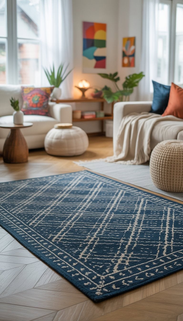
I love how a navy geometric rug can totally change a neutral room. The bold pattern adds interest, while the deep blue tone keeps things calming. It’s a simple way to make a space feel fresh.
Sometimes I pick a rug with shapes like triangles or diamonds. These patterns remind me of mid-century style, but still look modern. It’s easy to find many navy geometric rugs to fit any budget.
Use light pink velvet armchairs
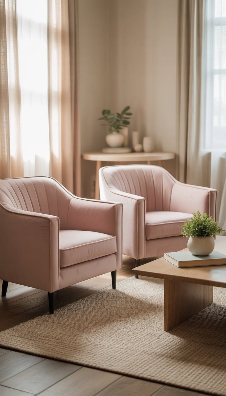
I love adding light pink velvet armchairs to a neutral room. The soft pink color stands out, but it still feels relaxing and warm.
When I walk into a space with these chairs, the velvet is smooth to the touch and looks elegant without being too bold. Light pink pairs well with whites, light grays, and even beige.
For more ideas on using pink chairs, I often check inspiration like these pink velvet chair looks on Pinterest. A chair like this can really lift the mood in any room.
Hang abstract prints with gold and beige accents
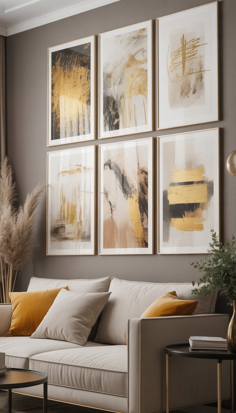
I love adding abstract wall art with gold and beige shades to my living room or hallway. The simple colors blend in with most neutral walls.
Touches of gold bring in a subtle shine that stands out but never feels too flashy. Beige keeps the look calm and warm at the same time.
I’ve found a lot of inspiration for this style by browsing ideas online, especially where abstract prints feature these elegant tones. It’s an easy way to update any space with style.
Style woven baskets with olive green throws
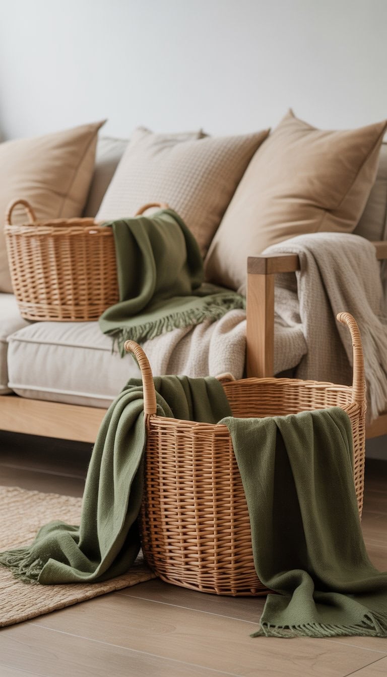
I love how woven baskets bring warmth and texture into any space. For a fresh touch, I drape an olive green throw over the side of my basket. The rich color stands out against neutral tones.
These baskets are not just pretty—they offer easy storage for blankets or pillows. I find that the olive green hue adds a calm, natural feel to the room.
Pairing baskets and colorful throws feels simple, but it always makes my room cozier and more inviting. If you want ideas, check out these decor inspiration photos.
Select concrete planters to balance bright yellows
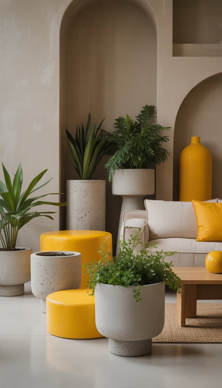
When I add bold yellow accents to a room, I reach for concrete planters. Their smooth, simple look helps ground the space and keeps things from feeling too busy.
I like how the neutral gray of concrete lets yellow really stand out. It’s easy to find shapes that fit modern or classic decor. Plus, making a concrete planter is a fun project I can try myself using molds and colored cement for extra creativity. Check out ideas for handmade concrete planters if you want to add color in a stylish way.
Incorporate matte black frames for vibrant artwork
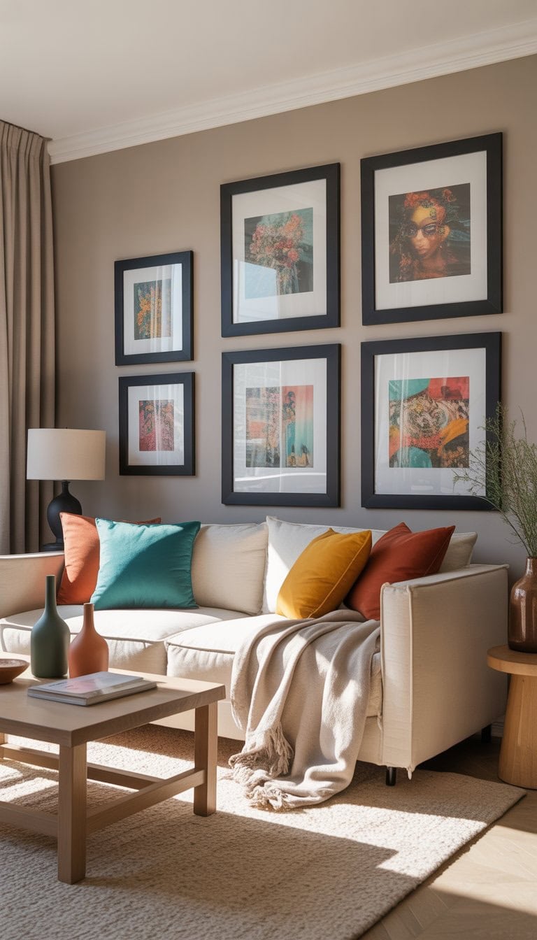
I love using matte black frames to highlight colorful art around my home. The deep, flat black makes every color pop without stealing the spotlight.
It feels modern but also works with most neutral palettes. For me, it’s an easy way to give any wall a finished and stylish touch.
Even if I change out the prints, the matte black always looks good. If you want more inspiration, there are some smart tips for black accent wall ideas at Havenly Blog.
Use creamy white linen curtains with subtle terracotta trims
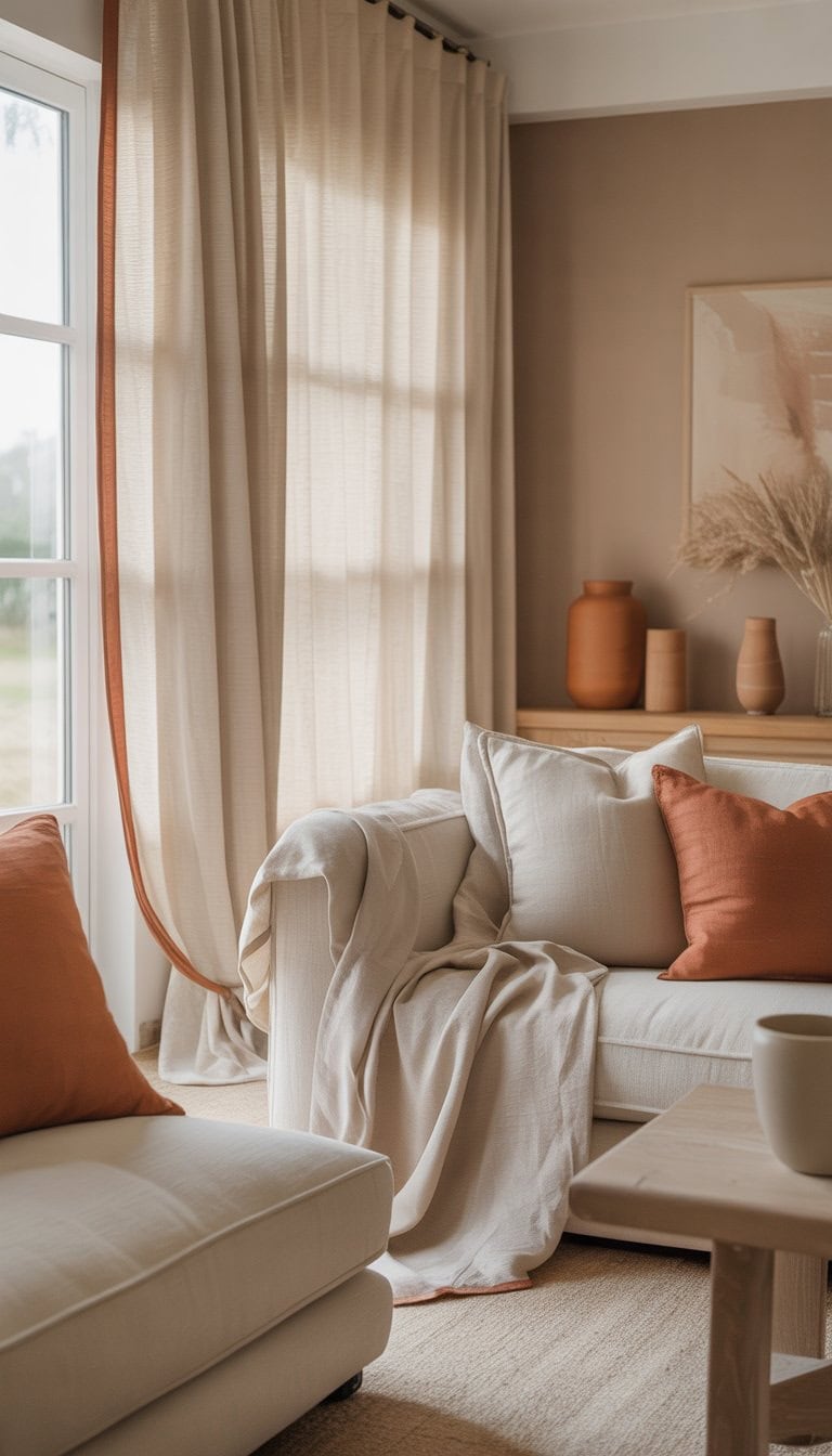
I like to use creamy white linen curtains in my spaces because they make the room feel airy and calm. The fabric lets in natural light while still giving me some privacy, which I appreciate.
Sometimes, I pick curtains with a hint of terracotta trim. This little pop of color gives warm energy without taking over. It also ties in beautifully with other earthy accents I add around the room.
I’ve seen this look work especially well with wooden floors and light walls. For inspiration, I’ve checked out options like these linen curtains with warm touches.
Add deep green botanical wall decals
I love using deep green botanical wall decals to bring nature inside my home. These decals are easy to apply, removable, and leave no mess.
When I want a quick style change, I just stick them on a plain wall for instant color and interest. Deep green shades look great with neutral walls and add a calm, fresh look.
For me, picking leafy designs gives a cozy vibe. I can change my mind and move them around whenever I want a new look. If you want an easy option, you can find a lot of choices at places like WallPops.
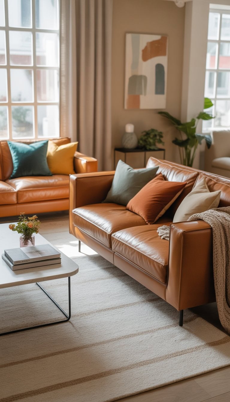
Choose neutral-toned sofas with mustard yellow pillows
I love using neutral sofas as a base for my living room. They make the room feel calm and work well with many styles.
To add interest, I place mustard yellow pillows on the couch. The yellow pop feels warm and modern without being too loud.
Sometimes I mix in simple patterns or textured covers. This adds even more style and keeps the look fresh.
Using mustard as an accent works especially well with neutral walls and floors, like in these living room ideas.
Place large pine wood coffee tables
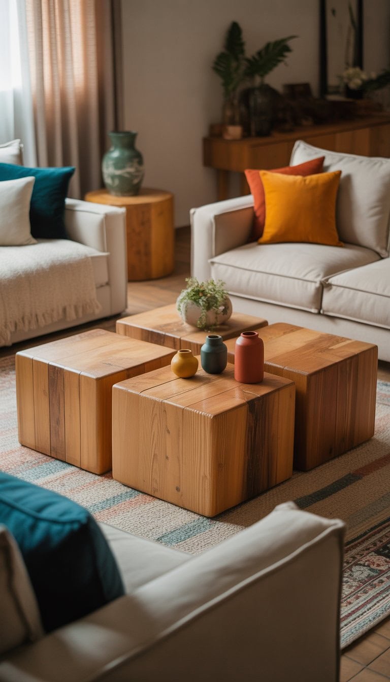
I love using large pine wood coffee tables because they bring a natural, laid-back feeling to any room. The warm color of pine adds character without clashing with other decor.
When I place a sturdy pine coffee table in the center, it becomes a practical spot for books, drinks, or even vibrant flower arrangements. If you need ideas for styles, I often check inspiration from pine coffee table designs.
Having one big statement piece keeps my space looking cozy and inviting but never too busy.
Use soft blush pink candles and holders
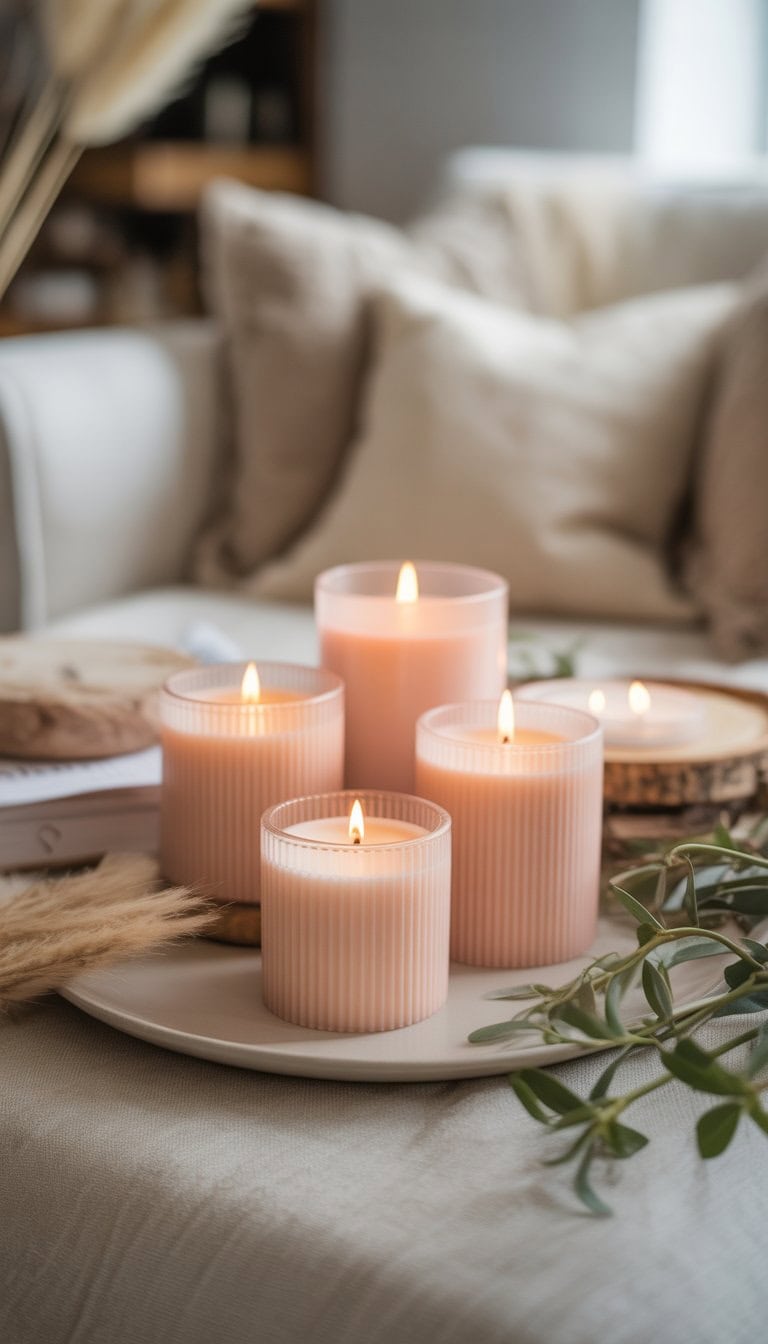
I love adding soft blush pink candles to a neutral room. The gentle color gives just the right amount of warmth without feeling too bold.
Small blush candle holders create a cozy look for dinner tables, mantels, or shelves. I’ve found that mixing these with taupe or beige decor keeps the space feeling calm and balanced.
If you want to try this, start with a few blush candle accessories for a simple, pretty upgrade.
Add pops of navy in throw blankets and ottomans
When I want to add color to a neutral room, I reach for navy throw blankets. They give my couch or chair a rich look without being too bold. I love how navy works with beige or white furniture.
Placing a navy ottoman in my living room is another easy trick. It looks stylish and also gives me an extra spot to sit or put my feet up. Navy accents mix well with most neutral palettes and add depth to the space.
For more inspiration, I like checking out navy decor ideas on sites like BY Design & Viz.
Include cheery red accent chairs sparingly
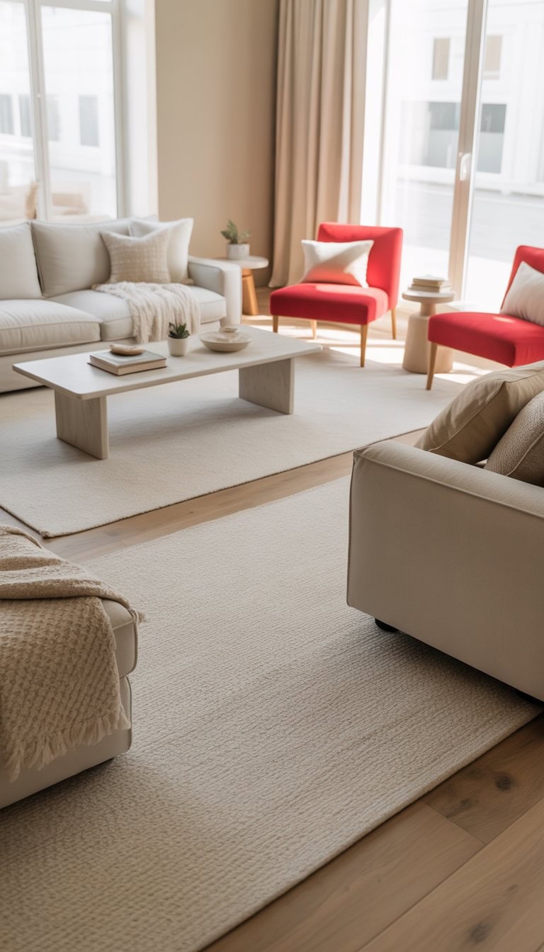
I love how a red accent chair can add a bright touch to a neutral room. I always try not to overdo it, though, because too much red can feel a little overwhelming.
Just one or two chairs are enough to draw the eye and make the space feel lively. For ideas, I sometimes look for inspiration in red accent chair living rooms.
The pop of color really stands out against beige, gray, or white walls. It also pairs nicely with navy or gold details.
Hang oversized beige and gold mirrors
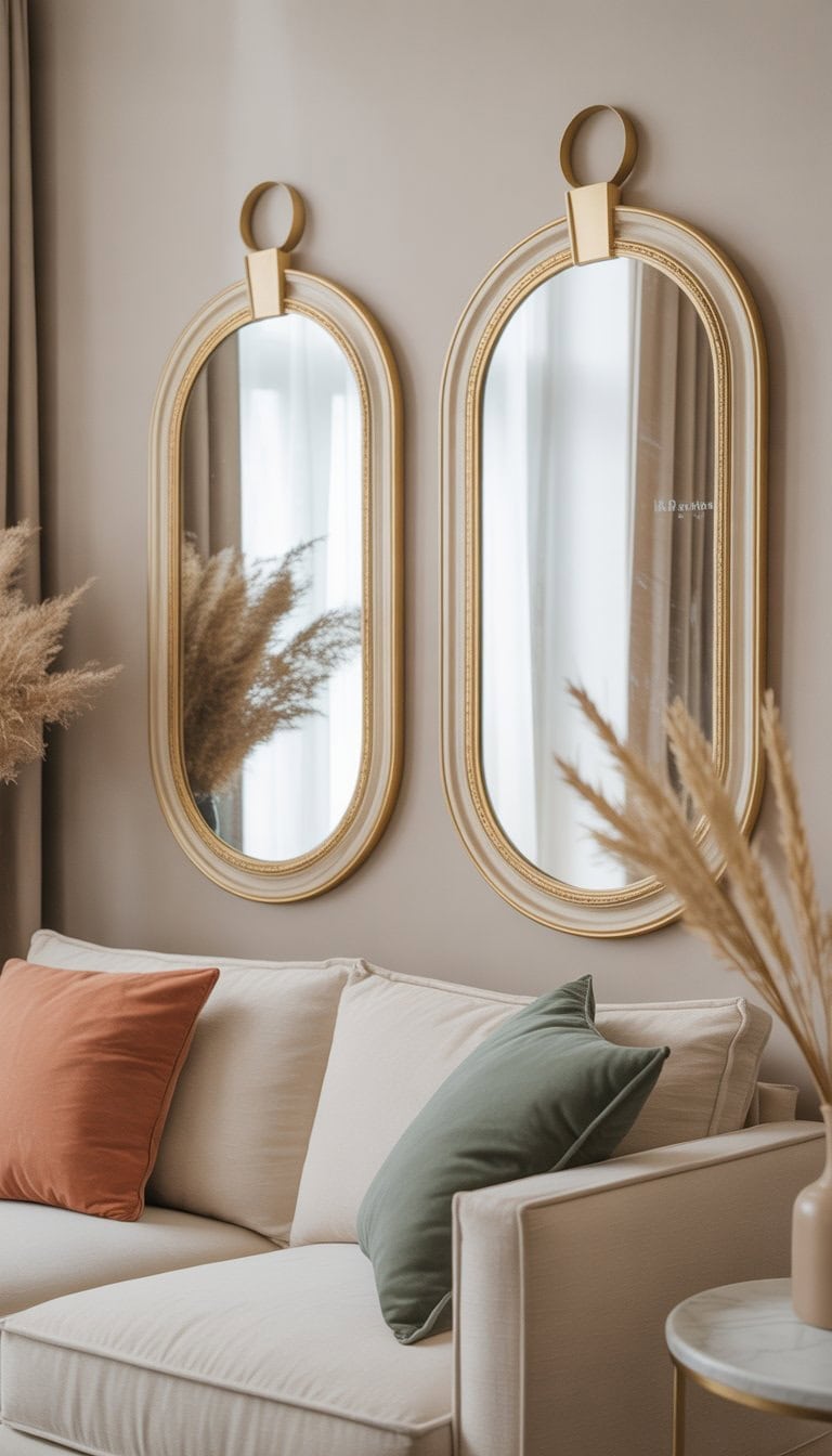
I like to use large beige and gold mirrors to add a sense of space and class to my rooms. They make any wall stand out, especially above a fireplace or behind a dining table.
The soft gold frames give just the right touch of shine, while beige keeps things warm and cozy. I find inspiration in ornate gold mirrors because they work with almost any color or style.
Use minimalist shelving units with sage decor pieces
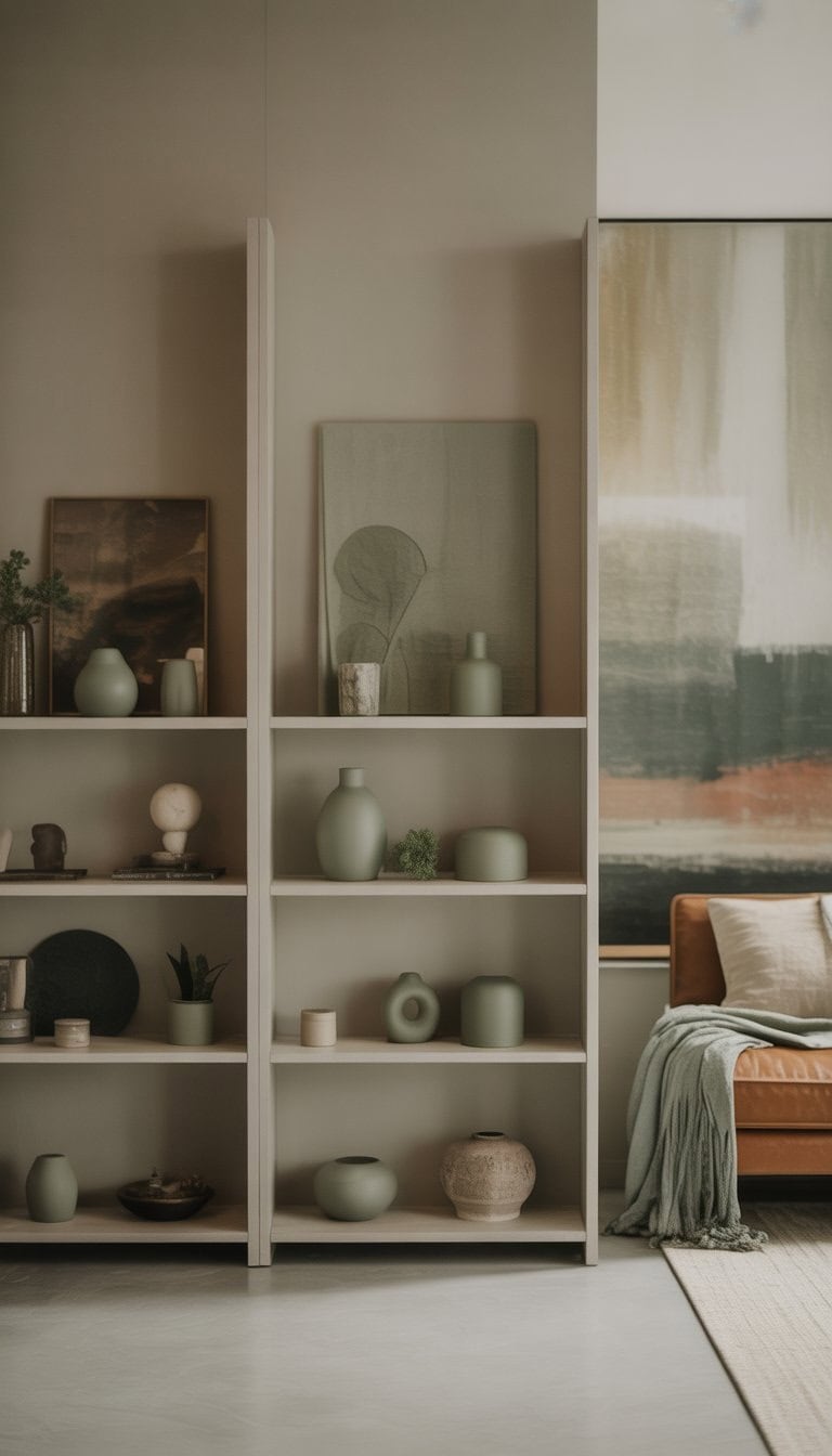
I love how simple shelves can change a room. When I add shelves in soft woods or white, it keeps the space feeling light.
To bring in some color, I choose sage green vases, planters, or small picture frames. Sage is a calming shade that fits right in with neutral tones.
I find that it works best when I keep other items minimal. Just a few well-chosen sage pieces make the shelves stand out without feeling crowded. For more ideas, I like to get inspiration from these sage green aesthetic ideas.
Choose soft caramel leather sofas
I always think soft caramel leather sofas are a smart pick. The warm color feels inviting and works well with almost any neutral wall.
When I bring one into a space, I like to add accent pillows in bold shades. This makes the couch stand out but still keeps the room relaxed.
Caramel leather is easy to match with creams, beiges, or even white for a calm vibe. I’ve seen some beautiful ideas on Pinterest, and I love trying new looks with each season.
How to Choose a Neutral Base for Vibrant Accents
Picking the right neutral paint or furniture color sets the mood for bold pieces. Neutrals let every pop of color shine, but what matters most is picking a tone that fits your space and style.
Finding the Right Neutral Palette
When I’m starting a new room, I focus on the mood I want. A calm, relaxing feel calls for soft grays, gentle beige, or off-white. For something brighter, I use crisp whites or very light taupe.
I always make sure my main neutral works with both the light in the room and any colorful accents I want. If I’m thinking of adding blues or greens as accents, a cooler neutral like pale gray works best. When I want to use reds or yellows, I pick a warmer neutral like cream or tan.
Here’s a quick table I use to match neutrals and accent colors:
| Neutral Base | Best Accent Colors |
|---|---|
| Cool Gray | Blue, green, purple |
| Warm Beige | Red, orange, golden yellow |
| Crisp White | Any bold color |
| Soft Taupe | Teal, rust, coral |
I always remember that a neutral base doesn’t have to look plain. Patterns, textures, and different finishes help even simple colors stand out. For more expert tips and color pairing ideas, I find the advice in this neutral paint color guide useful.
Balancing Warm and Cool Undertones
It’s easy to miss how much undertones affect the whole feel of a room. I check the hidden hue in every paint or fabric sample by putting them next to pure white paper. If the neutral seems blue, it’s cool. If it looks yellow or pink, that’s a warm undertone.
Mixing warm and cool undertones in the same room isn’t impossible, but I do it on purpose and in small doses. If my base is warm, I use warm-toned accents for harmony. If I want contrast, I add a cool pop but keep it simple.
Tips I follow for undertone balance:
- Use a neutral with the same undertone as most of my planned accents.
- Pair cool neutrals with cooler metals like chrome.
- Use warm neutrals with cozy materials like wood or brass.
When I need a little extra help, I like looking up ideas for decorating a neutral space with color. This gives me real-life examples of undertones and pops working together.
Tips for Incorporating Pops Of Color in DIY Decor
I always find that adding color to neutral spaces keeps things lively yet relaxed. A few thoughtful touches can really make a room feel fresh and personal without feeling overwhelming.
Highlighting with Accessories and Art
When I want to breathe life into neutral rooms, I start with pillows, throws, and rugs. Bright cushions on a beige sofa or a bold rug on light wood floors instantly draw the eye. I like to group different textures, such as velvet cushions with soft cotton throws, to keep things interesting.
Art is also a go-to for me. A colorful print or painting makes a statement above a couch or bed. Sometimes I choose pieces with hints of the same shade as my accent pillows. This creates a pulled-together look. For smaller pops, I turn to vases, candles, or even a stack of colorful books on a coffee table.
Plants bring in a dose of green, which always works well with other colors. If I want more variety, I use pots in fun, bright shades for an extra kick. For more inspiration, you can check out ideas for neutral home decor with pops of color.
Seasonal Color Swaps for Effortless Renewal
I love switching things up with the seasons. In spring, I add pastel throws and floral pillows to lighten the mood. For summer, bright colors like yellow or coral feel cheerful. When fall comes, I bring in rust, olive, and mustard accents for warmth. Winter is perfect for deeper jewel tones like navy or emerald.
Keeping a collection of pillow covers and small decorative items allows me to change things around easily. I store them in labeled bins for fast swaps. Even just changing out an art print or a few accessories makes my home feel brand new. If you want more detailed seasonal tips, decorating with pops of color can be a simple way to refresh your space without redecorating everything.
Frequently Asked Questions
I get a lot of questions about adding color to a neutral home without losing that clean, calming vibe. Accent walls, plants, and unique textures can all help liven up a space while still keeping things balanced.
How do I incorporate color into a neutral space without overwhelming it?
I start by picking one or two colors that make me happy, like muted teal or sage green. I use these shades in small ways—a single accent wall, some throw pillows, or a piece of art.
I look for earth tones or soft hues, since these blend well without shouting for attention. Repeating the color in different spots helps the room look pulled together.
What are some easy DIY projects to add a splash of color to my living room?
One of my favorites is painting a muted teal accent wall. It’s simple but makes a big impact.
I also swap out old pillow covers for new ones in bold colors or patterns. Making or painting terracotta plant pots for fresh greenery is another project that adds warmth and life.
Can you suggest ways to bring in color through textiles for a cozy, yet chic look?
I choose mustard yellow throw pillows or drape a chunky knit blanket in a bright shade at the end of the sofa for instant coziness.
Sage green curtains work great—they’re subtle, earthy, and still add color. I layer rugs, too, mixing neutral bases with a colorful accent on top to create a lived-in, stylish vibe.
What are some unique color accents I can add to my neutral kitchen?
Small touches make a big difference in my kitchen. I use colored bar stools or add navy blue seat cushions to wooden chairs.
I also place a bowl of citrus fruits on the counter or display a piece of colorful pottery on open shelves for a fresh look. Swapping out kitchen towels with patterns or fun shades keeps things interesting.
How do I choose the right color accessories for a neutral bedroom?
I pick accessories in tones that feel restful, like deep blue or soft green. Mixing in one or two bright items, such as a lamp or art print, helps my room feel personal but never chaotic.
I try laying different colored throws at the end of my bed, or changing pillow shams until I find the right color balance.
What’s the best way to create a colorful focal point in a neutral open-plan area?
I use a large, colorful rug to ground a space or hang oversized artwork with bold hues to draw the eye. Sometimes, I group plants in terracotta pots in one spot for a living, green focal point that’s still soft.
Mixing a navy couch with wooden tables or trying a patterned accent chair are other ways I like to add personality without clutter.


 for Effortlessly Chic, Relaxed Spaces")


: Inspiration for Creating Your Dream Space")

